Getting started with ‘climenv’
James L. Tsakalos (james.tsakalos@gmail.com), Martin R. Smith, Federico Luebert, Ladislav Mucina
2025-04-15
Source:vignettes/climenv.Rmd
climenv.RmdAn example application of climenv
This vignette shows on example application of climenv
(short for Climatic
Envelope) to illustrate the concepts and
functionality incorporated in the package. Specifically, the example
facilitates easy downloading, extraction and visualization of three of
the most globally recognizable modeled data sets (CHELSA, WorldClim 2
and NASA’s SRTM elevation) using example multi and single geospatial
polygon and point data.
Specifically, supplied with geospatial polygon and point data the package can easily download, extract and visualize climatic data. The visualization options include a custom plot coupled with helpful tabulated climatic properties, Holdridge’s (1967) life zone classification and Walter-Lieth’s (1960) climate diagrams. To our knowledge this is the first time that the Holdridge diagram has been presented in R.
Downloading climate and elevation data
ce_download downloads WorldClim 2 (Fick & Hijmans,
2017), CHELSA (Karger et al., 2017) and NASA Earth Explorer’s SRTM (Farr
et al., 2007). CHESLA and WorldClim are available at a spatial
resolution of 30 arc-seconds (c. 1 km2). The data are freely
available as a series of raster tiles (one for each month) with their
spatial extent spanning the globe. Specifically, the function downloads
the mean, minimum and maximum temperature and mean precipitation using
the climatic predictions for periods 1979–2013 (CHELSA) and 1970–2000
(WorldClim 2).
ce_download also downloads NASA’s SRTM data at the same
30 arc-second (c. 1 km2) resolution. However, unlike CHELSA
and WorldClim, the SRTM data can be downloaded as a series of individual
tiles. While the spatial extent of CHELSA and WorldClim 2 spans the
globe, ce_download derives and mosaics the SRTM tiles
matching the extent provided by the user. Downloading a subset of tiles
is advantageous because it will download quicker and occupy less
storage.
Because the vignette is required to run quickly and downloading climatic data (4.67 or 13.7 GBs for CHELSA and WorldClim 2, resp.) takes considerable time (ca. 6 or 19 minutes at 100 Mbit/s). For simplicity, we have provided code to create artificial climate data of known properties. For a full demonstration on how to download data please see the package help documentation or Tsakalos et al. (2021).
# Let's make some training data

# Create temporary file to supply to the ce_extract
temp_path <- tempfile()

# Create the  sub-folders
dir.create(file.path(temp_path, "elev"), recursive = TRUE)
dir.create(file.path(temp_path, "prec"), recursive = TRUE)
dir.create(file.path(temp_path, "tmax"), recursive = TRUE)
dir.create(file.path(temp_path, "tavg"), recursive = TRUE)
dir.create(file.path(temp_path, "tmin"), recursive = TRUE)

# Create a empty raster serving as a base
r <- terra::rast(ncol = 10, nrow = 10)

# Modify the base Raster values and save them in correct configuration

#* Elevation 100m ####
terra::values(r) <- 1:100
terra::writeRaster(r, paste0(temp_path, "/elev/srtm.tif"))

# Prec
x <- c(5, 10, 15, 20, 25, 34.40666, 25, 20, 15, 10, 5, 0) * 8
temp2 <- paste0("prec_", sprintf("%02d", 1:12), ".tif")
for (i in seq_along(temp2)) {
  terra::values(r) <- x[i]
  terra::writeRaster(r, paste0(temp_path, "/prec/", temp2[i]))
}

# tmax
x <- c(43, 38, 33, 29, 25, 19.8, 17.01, 21, 25, 30, 37, 44)
temp2 <- paste0("tmax_", sprintf("%02d", 1:12), ".tif")
for (i in seq_along(temp2)) {
  values(r) <- x[i]
  writeRaster(r, paste0(temp_path, "/tmax/", temp2[i]))
}

# tmin
x <- c(43, 38, 33, 29, 25, 19.8, 17.01, 21, 25, 30, 37, 44) / 2
temp2 <- paste0("tmin_", sprintf("%02d", 1:12), ".tif")
for (i in seq_along(temp2)) {
  values(r) <- x[i]
  writeRaster(r, paste0(temp_path, "/tmin/", temp2[i]))
}

# tave
x <- c(43, 38, 33, 29, 25, 19.8, 17.01, 21, 25, 30, 37, 44) -
  c(c(43, 38, 33, 29, 25, 19.8, 17.01, 21, 25, 30, 37, 44) / 2) / 2
temp2 <- paste0("tavg_", sprintf("%02d", 1:12), ".tif")
for (i in seq_along(temp2)) {
  values(r) <- x[i]
  writeRaster(r, paste0(temp_path, "/tavg/", temp2[i]))
}

# Create a polygon file from the raster
terra::values(r) <- 1:100
pol_py <- sf::st_as_sf(terra::as.polygons(r))
pol_py$grp <- c(rep("low", 25), rep("high", 75))

# Create a point file from the raster
pol_pt <- sf::st_as_sf(terra::as.points(r))
pol_pt$grp <- c(rep("low", 25), rep("high", 75))
Extracting the statistics of the distribution of values for each climatic variable within the area
Now that the climate and elevation data have been created, the next
step is to use ce_extract to extract the climatic data
using the pol_py and pol_pt geospatial data sets. This function’s
general workflow is to read in the newly downloaded data as a series of
raster stacks (processing time should be shorter when using a raster
stack, see Hijmans, 2020). Once the stacks are read in, the function
continues to crop and mask using a unique feature stored in the
multi-point or multi-polygon geospatial data set. For example, the
climatic and environmental data can be extracted for all Sibillini
National Park or high and low sections. This feature is controlled by
the ‘location.g’ argument, specifying a column in the geospatial data
set.
ce_extract adds a buffer of 2 km when small polygon
sizes return no results. The polygon is transformed from a geographic
coordinate system into a projected coordinate system using the
‘spTransform’ function. This transformation allows for a metric buffer
to be added to the polygon.
# Extract the climate data

data_py <- ce_extract(
  file.path(temp_path),
  location = pol_py,
  location_g = NULL
)
#> Warning in .location_helper(location, location_g, location_df): location_g must be one of: lyr.1, grp, id
#> Defaulting to a unique id for each polygon or point object

data_pt <- ce_extract(
  file.path(temp_path),
  location = pol_pt,
  location_g = NULL
)
#> Warning in .location_helper(location, location_g, location_df): location_g must be one of: lyr.1, grp, id, optional
#> Defaulting to a unique id for each polygon or point object

# Remove temporary data
unlink(file.path(temp_path))
The returned data object is a list containing five data sets. Specifically, one data set each is returned for precipitation and mean-, maximum- and minimum-temperature. One data set is produced for altitude and continentality. These data sets are amenable to further use by the user, such as covariates in any number of modelling exercises.
Visualizing the climatic and elevation data
climenv offers three functions for visualising the
climatic data extracted from points or polygons in various formats.
The third climate diagram is one of our own design (see Macintyre & Mucina, 2021).
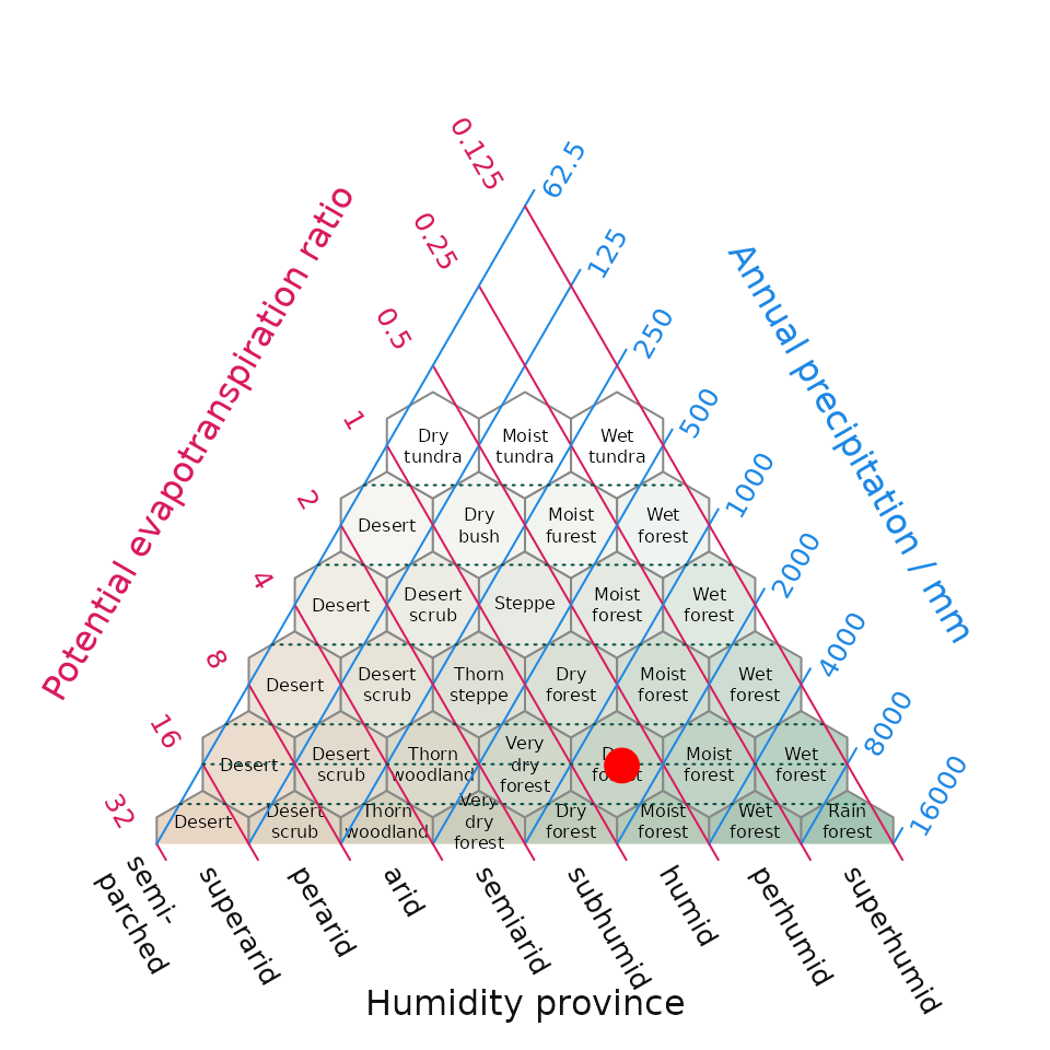
plot_h produces Holdridge’s life zone classification
plot, also known as the Holdridge Life Zone System or Holdridge
Bioclimatic Classification System, is based on three main factors that
influence the distribution of vegetation and ecosystems. By combining
temperature, precipitation, and potential evapotranspiration Holdridge’s
classification plot divides the Earth’s surface into distinct life zones
or biomes (sensu Holdridge). It allows for the identification and
characterization of different biomes, such as tropical rainforests,
deserts, grasslands, and tundra, based on their distinct climatic
conditions and provides a unified framework for studying vegetation
patterns, ecological dynamics, and potential shifts in response to
climate change. To simplify the visualization of life zone data, we have
implemented the automatic creation of Holdridge plots by the addition of
the plot_h function which provides a convenient wrapper
from within climenv for the function
PlotHoldridge within the Ternary R package
(Smith 2017). This paper is the formal description of this plotting tool
which has been developed to complement climenv
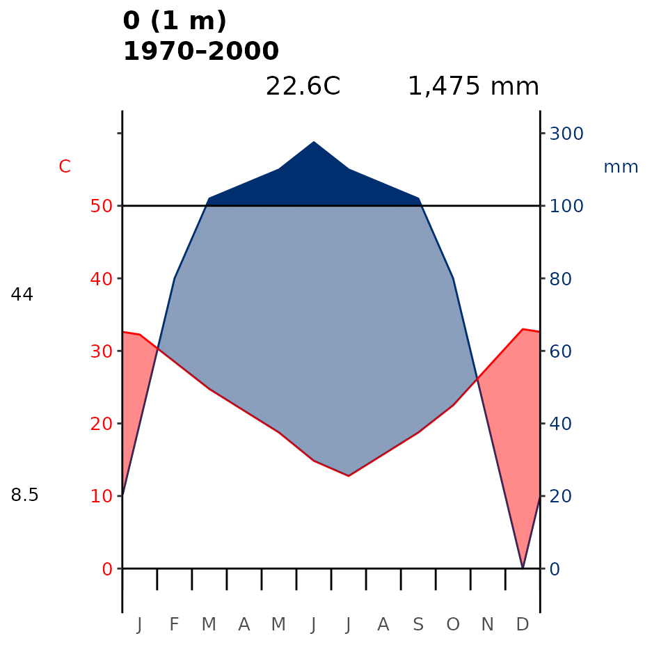
plot_wl produces the Walter-Lieth (1960) climatic
diagram. This diagram consists of two primary components: temperature
and precipitation, which when combined in a single diagram allows for a
comprehensive visualisation of climate patterns. Specifically, it
provides insights into seasonal variations, the duration and intensity
of wet and dry periods, and the overall climate regime of a particular
location (or the average for an area encompassed by a spatial polygon).
Here our package is a wrapper for the existing diagwl
function of the climatol R package (Guijarro, 2019).
# Make Holdridge's (1967) life zone classification diagram
plot_h(data = data_py, "0")
Fig 1. Position of the training data within Holdridge’s (1967) life zone classification. The surface shading in the background is new addition to the original life zone classification and helps interpretation by converting a point in evapotranspiration-precipitation space to an appropriate cross-blended hypsometric colour – in this intuitive instance colours tending towards the red spectrum feature higher temperatures blended with lower precipitation compared while colours tending towards the blue colour spectrum have lower temperatures and higher precipitation.
# Make Walter-Leigh's (1960) climate diagram
plot_wl(data = data_py, "0")
Fig 2. Walter-Lieth’s climatic diagram (1960) of the training data. When precipitation is > 100 mm, the scale increases from 2mm C-1 to 20 mm C-1 (as indicated by the black horizontal line) to avoid too high diagrams in very wet locations. This change is indicated by a black horizontal line, and the graph over is filled in solid blue. When the precipitation graph lies under the temperature graph (P < 2T) we have an arid period (filled in dotted red vertical lines). Otherwise the period is considered humid (filled in light blue). Daily maximum average temperature of the hottest month and daily minimum average temperature of the coldest month are labeled in black on the left margin of the diagram.
# Make the custom climate diagram
oldpar <- par(mar = c(1.5, 2.8, 2, 17))
plot_c(data = data_py, "0")
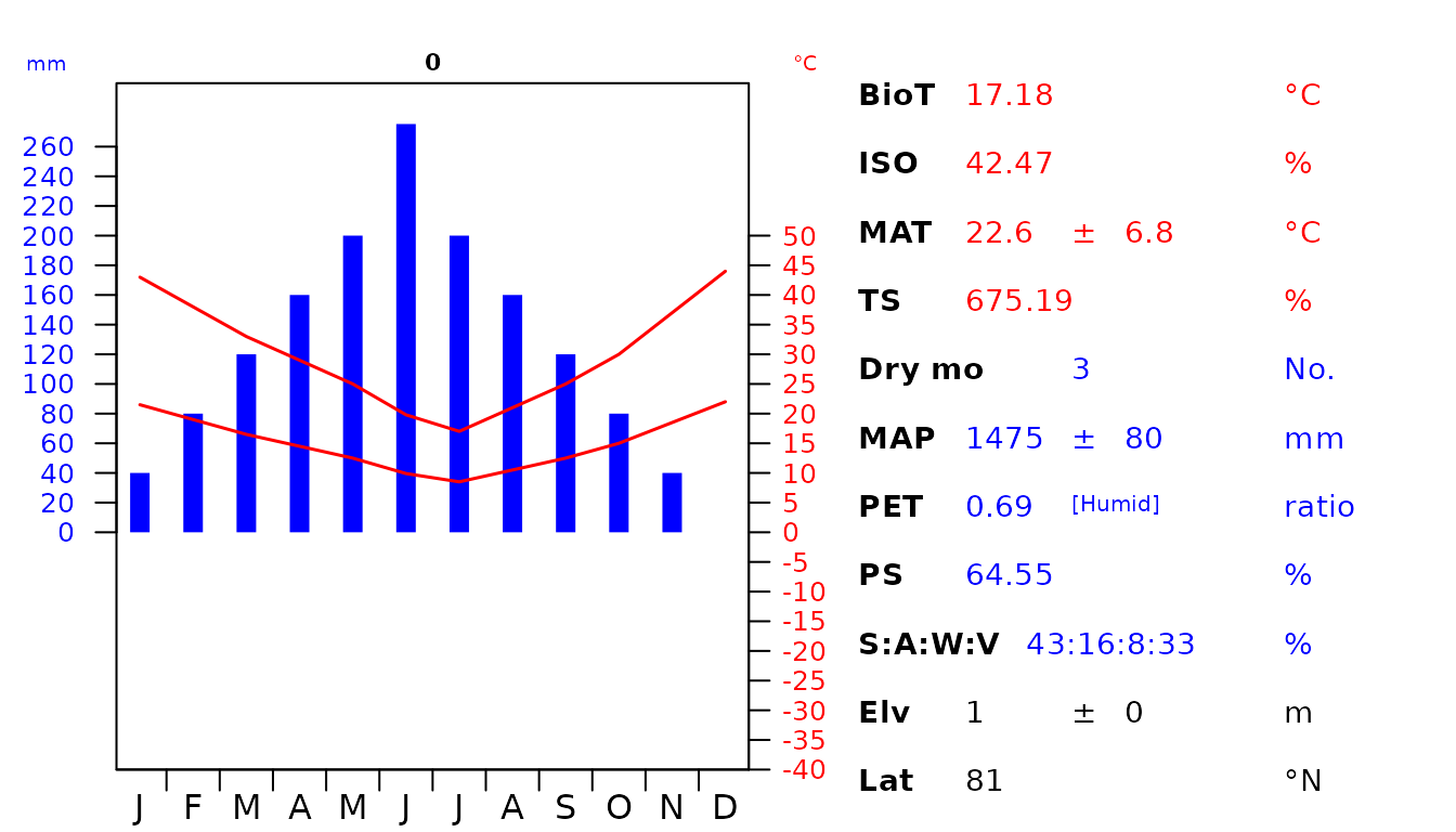
Fig 3. Custom diagram showing the climatic envelope of the training data. The abbreviations used are as follow: biotemperture (BioT), isothermality (ISO), mean annual temperature (MAT), temperature seasonality (TS), number of dry months with < 50 mm rainfall during the month (Dry mo), mean annual precipitation (MAP), potential evapotranspiration (PET), precipitation seasonality (PS), seasonal rainfall percentage in Summer (S), Autumn (A), Winter (W), Vernal (V), elevation (Elv) and latitude (Lat).
par(oldpar)