Exploring the Italian biome data sets
James L. Tsakalos (james.tsakalos@gmail.com), Martin R. Smith, Federico Luebert, Ladislav Mucina
2025-04-15
Source:vignettes/Italian_Biomes.Rmd
Italian_Biomes.RmdSpatial distribution of the Italian Biome data sets
climenv includes three data sets that feature Biome
information for Italy. The data sets include it_py,
it_pt and it_data. The prefix it stands for
“Italy”. Within it_py the Biomes are represented by
polygons (py), within it_pt the Biomes have been sampled by
a gridded (c. 5km) point (pt) data set. Lastly, it_data is
the output of the ce_extract() function generated using
WorldClim 2 climate and Mapzen digital elevation.
# Make a map of the Italian polygons data set
plot(it_py, key.pos = NULL, border = NA, main = "")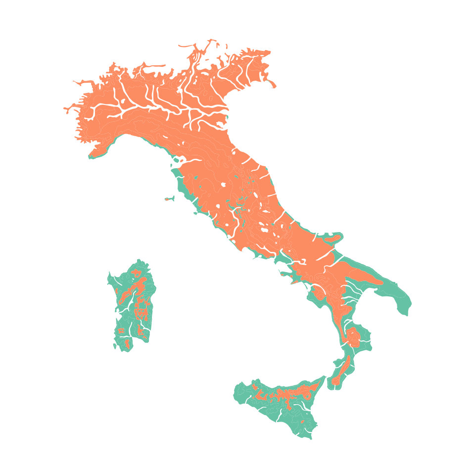
Fig 1. Mediterranean and Nemoral Biomes of Italy (Mucina et al., 2023). The Mediterranean Biome is shaded green, while the Nemoral Biome is shaded in orange.
From Fig 1, it is evident that the Italian polygons data set effectively represents the spatial distribution of the Mediterranean and Nemoral Biomes derived from the aggregation of vegetation typologies across the entire geography of Italy. This data set offers valuable insights into the extent and boundaries of different Biomes within the region. Nevertheless, it is essential for users to recognise that should they have smaller or larger scaled maps, which capture the spatial boundaries of different vegetation groups such as communities, habitats, disturbance classes, etc., they would serve as an ideal candidate for analyses with our package.
# Make a map of the Italian points data set
plot(it_pt, pch = 19, cex = 0.5, key.pos = NULL, main = "")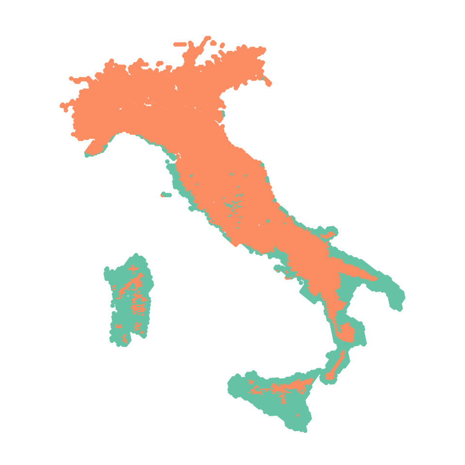
Fig 2. Mediterranean and Nemoral Biomes of Italy (Mucina et al., 2023). The Mediterranean Biome is coded as green points, while the Nemoral Biome is coded as orange points.
By design Fig 2, spans almost the same spatial extent as in Fig 1. Each of the points (n = 9963) within the Italian point data set is spaced at c. 5m in a grid configuration. Here users containing georeferenced features such as quadrat locations, mapping notes of vegetation typologies, disturbance regimes, etc., they would serve as an ideal candidate for analyses with our package. By utilising these polygon or point mapping structures as a foundation, our package enables users to leverage the inherent structure and spatial representation they require to conduct their own targeted investigations effectively. This flexibility accommodates a wide range of research needs and empowers users to explore the intricate relationships of vegetation groups, habitats, disturbance classes, structural classes, etc., on their terms.
Downloading climate and elevation data
The function ce_download enables users to download both
climate and elevation data. Users have the option to select climate data
from either WorldClim 2 (Fick & Hijmans, 2017) or CHELSA (Karger et
al., 2017; Karger et al., 2021). Regarding elevation data, users can
choose either the NASA Earth Explorer’s SRTM (Farr et al., 2007) or
Mapzen terrain tiles (Hollister & Shah, 2018).
In this specific example, we have utilised the default settings of
ce_download to download WorldClim 2 climate data and Mapzen
elevation data for the Italian polygon data set. However, please note
that the following code chunk is intentionally set not to evaluate
because its execution requires time. Fortunately, to facilitate the
presented examples, we have already stored the downloaded and extracted
(using ce_extract) data within the package (see below for
more details).
# Do not execute this code if you are in a hurry as it will take time depending
# on the strength and speed of your internet connection.

# This part downloads the data and takes time
ce_download(
  "C/example_output..",
  location = it_py
)

# Once the data is downloaded, this function is quick.
it_data <- ce_extract(
  "C/example_output..",
  location = it_py,
  location_g = "GB"
)
# Fortunately you can avoid the above steps by simply loading the data
data("it_data")
Climatic envelope of the Italian Biome data sets
climenv provides three plotting functions, one for the traditional
Holdridge life zone classification scheme (plot_h), one for
the Walter-Lieth climate diagrams (plot_wl) and a new
custom plot (plot_c) integrating features from both systems
as well as the commonly used bioclim variables (Hijmans et al.,
2005).
One of our graphical outputs is the Holdridge (1967) life zone classification plot. Holdridge’s life zone classification plot, also known as the Holdridge Life Zone System or Holdridge Bioclimatic Classification System, is based on three main factors that influence the distribution of vegetation and ecosystems. By combining temperature, precipitation, and potential evapotranspiration Holdridge’s classification plot divides the Earth’s surface into distinct life zones or biomes (sensu Holdridge).
# Make Holdridge's (1967) life zone classification diagram
plot_h(data = it_data, "MED")
plot_h(data = it_data, "NEM")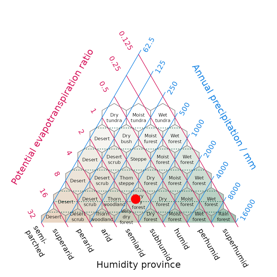
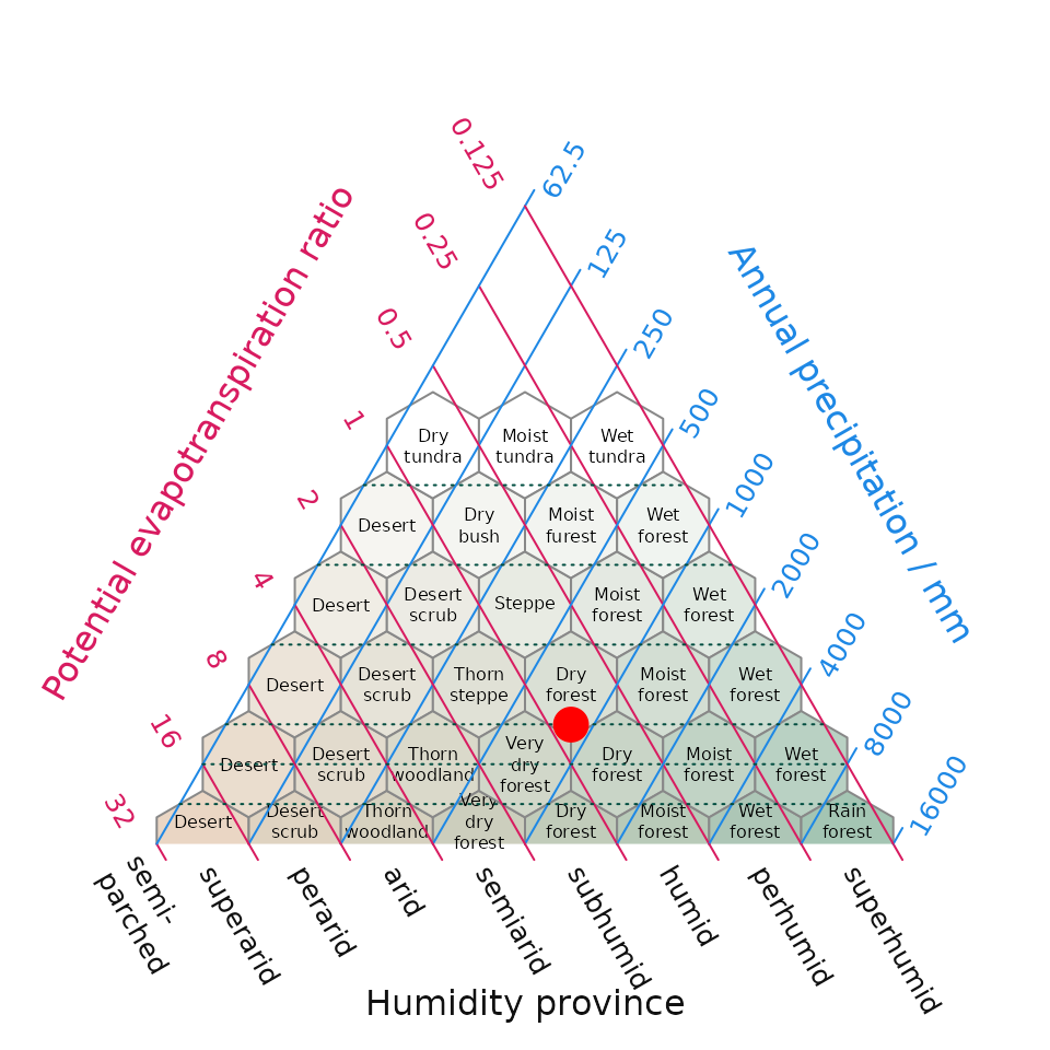
Fig 3. Position of the Mediterranean (MED) and Nemoral (NEM) Biomes within Italy derived using WorldClim climate within Holdridge’s (1967) life zone classification. The surface shading in the background is new addition to the original life zone classification and helps interpretation by converting a point in evapotranspiration-precipitation space to an appropriate cross-blended hypsometric colour – in this intuitive instance colours tending towards the red spectrum feature higher temperatures blended with lower precipitation compared while colours tending towards the blue colour spectrum have lower temperatures and higher precipitation.
Another common graphical output is the Walter-Lieth (1960) climatic diagram. Here our package is a wrapper for the existing diagwl function of the climatol R package (Guijarro, 2019). This diagram consists of two primary components: temperature and precipitation, which when combined in a single diagram is supposed to allow for a comprehensive visualisation of climate patterns.
# Make Walter-Leigh's (1960) climate diagram
plot_wl(data = it_data, "MED")
plot_wl(data = it_data, "NEM")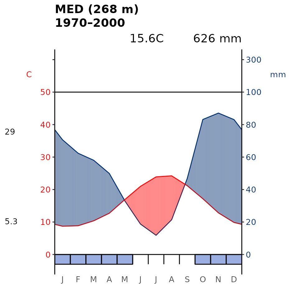
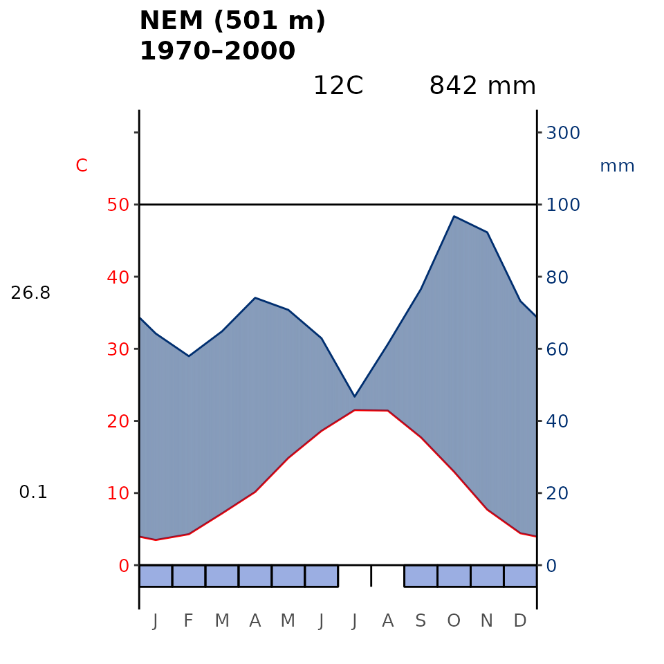
Fig 4. Walter-Lieth’s climatic diagram (1960) of the Mediterranean (MED) and Nemoral (NEM) Biome within Italy derived using WorldClim. When precipitation is > 100 mm, the scale increases from 2mm C-1 to 20 mm C-1 (as indicated by the black horizontal line) to avoid too high diagrams in very wet locations. This change is indicated by a black horizontal line, and the graph over is filled in solid blue. When the precipitation graph lies under the temperature graph (P < 2T) we have an arid period (filled in dotted red vertical lines). Otherwise the period is considered humid (filled in light blue). Daily maximum average temperature of the hottest month and daily minimum average temperature of the coldest month are labeled in black on the left margin of the diagram.
Lastly, we present our custom diagrams which incorporate elements from Holdridge’s (1967) life zone classification, Walter-Lieth’s climatic diagram (1960), and the widely utilised bioclimatic variables (Hijmans et al., 2005) commonly employed in ecological and environmental research. These variables are crucial in describing environmental factors that shape the distribution and behaviour of organisms, including plants, as evidenced by the high citation count of works by Holdridge, Walter-Lieth, and Hijmans.
# Make the custom climate diagram
oldpar <- par(mar = c(1.5, 2.8, 2, 17))
plot_c(data = it_data, "MED")
plot_c(data = it_data, "NEM")
par(oldpar)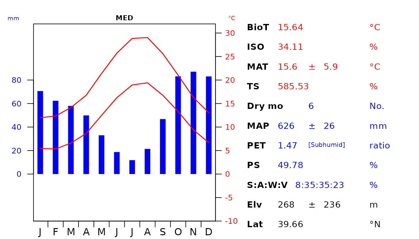
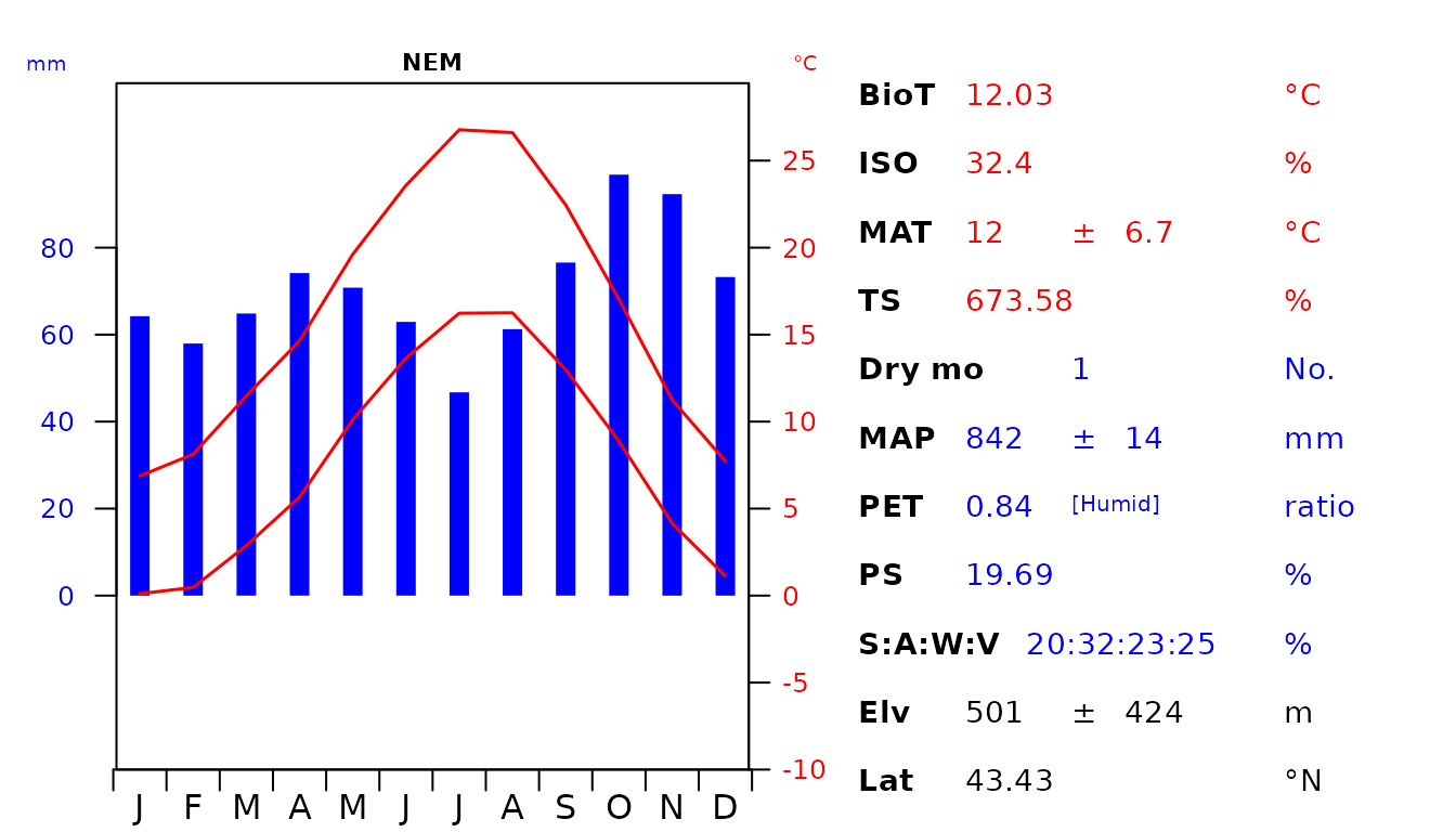
Fig 5. Custom diagram showing the climatic envelope of the Italian Mediterranean (MED) and Nemoral (NEM) Biomes. The abbreviations used are as follow: biotemperture (BioT), isothermality (ISO), mean annual temperature (MAT), temperature seasonality (TS), number of dry months with < 50 mm rainfall during the month (Dry mo), mean annual precipitation (MAP), potential evapotranspiration (PET), precipitation seasonality (PS), seasonal rainfall percentage in Summer (S), Autumn (A), Winter (W), Vernal (V), elevation (Elv) and latitude (Lat).
Notes on selecting appropriate climatic variables
To ensure the selection of climatic variables for discriminatory analyses, numerous data-driven approaches can be employed. For instance, with lots of data, one could use CART, random forests, boosted regression trees, or any number of machine learning algorithms to determine which variables are the most appropriate (robust and ecologically meaningful) for delineating between classes , for the purposes of discriminatory analyses. In this extended vignette, we will delve into an exploration of which climatic variables are most appropriate for delineating our highly specific example data set of Italian Biomes (Italian point data set). By employing these rigorous methods, one can make a more informed decisions about the choice of climatic variables that play a major role in characterising and distinguishing the climatic envelopes of the various biomes in their own study areas.
# Let's start by extracting the climate data for all points in the
# italy_pt data.
it_data_extended <- ce_extract(
  path = "C:/Users/jamie/OneDrive/Desktop/temp",
  location = it_pt
)
# If you haven't downloaded the climate and elevation data by following the code
# above you could simply load the data()
data("it_data_extended")

# But this data needs to be reformatted a bit.

# Let's start by calculating the bioclim variables:
bioclim <- data.frame(dismo::biovars(
  prec = as.matrix(it_data_extended$prec[, 1:12]),
  tmin = as.matrix(it_data_extended$tmin[, 1:12]),
  tmax = as.matrix(it_data_extended$tmax[, 1:12])
))

# Let's make some more intuitive names for these variables:
colnames(bioclim) <- c(
  "Mean_annual_temperature",
  "Mean_diurnal_range",
  "Isothermality",
  "Temperature_seasonality",
  "Max_temperature_of_warmest_month",
  "Min_temperature_of_coldest_month",
  "Temperature_annual_range",
  "Mean_temperature_of_the_wettest_quarter",
  "Mean_temperature_of_driest_quarter",
  "Mean_temperature_of_warmest_quarter",
  "Mean_temperature_of_coldest_quarter",
  "Total_annual_precipitation",
  "Precipitation_of_wettest_month",
  "Precipitation_of_driest_month",
  "Precipitation_seasonality",
  "Precipitation_of_wettest_quarter",
  "Precipitation_of_driest_quarter",
  "Precipitation_of_warmest_quarter",
  "Precipitation_of_coldest_quarter"
)

# Now get the Holdridge variables
hold <- bioclimate(
  as.matrix(it_data_extended$tavg[, 1:12]),
  as.matrix(it_data_extended$prec[, 1:12])
)

# Make some more intuitive names for these variables
colnames(hold)[1:3] <- c(
  "Mean_Annual_Biotemperature",
  "Total_Annual_Precipitation",
  "Potential_Evapotranspiration_Ratio"
)

# Join them together along with elevation and altitude
dat <- cbind(
  bioclim, hold[, c("Mean_Annual_Biotemperature",
                    "Potential_Evapotranspiration_Ratio")],
  elev = it_data_extended$elev,
  lat = it_data_extended$lat
)

# Let's just fix the last two column names
colnames(dat)[c(22, 23)] <- c("Elevation", "Latitude")

# Now let's add the Biome type as a column
dat$class <- as.factor(it_pt$GB)
Random Forest is an ensemble learning algorithm that combines multiple decision trees to make predictions. Decision trees are structures that make predictions by splitting data based on if-else conditions. They create a tree-like model of decisions. Random Forest adds randomness by using a technique called bootstrapping, which involves randomly sampling the data with replacement. It also introduces variability by randomly selecting a subset of predictor variables for each split in a decision tree. In Random Forest, a collection of decision trees is built. Each tree is trained on a different subset of the data and uses a random subset of predictor variables. Random Forest models are known for their robustness, accuracy, and resistance to overfitting. They handle high-dimensional data well, are less affected by outliers, and can capture complex relationships between variables. Additionally, Random Forest provides an estimate of variable importance, which helps with feature selection and interpretation. For more information please refer to Breiman (2001).
# Now we are about ready to start the random forests analyses

# Load the required package
library("randomForest")

# Now we need to split the dataset into training and testing sets
set.seed(123)  # For reproducibility

train_indices <- sample(
  seq_len(dim(dat)[1]), dim(dat)[1] * 0.8
)  # 80% for training
train_data <- dat[train_indices, ]
test_data <- dat[-train_indices, ]

# Train the Random Forest model
model <- randomForest(formula = class ~ ., data = train_data)

# Make predictions on the test set
predictions <- predict(model, newdata = test_data)

# Evaluate the model's performance
confusion_matrix <- table(predictions, test_data$class)
accuracy <- sum(diag(confusion_matrix)) / sum(confusion_matrix)
print(confusion_matrix)
#>
#> predictions  MED  NEM
#>         MED  474   42
#>         NEM   55 1422
print(paste("Accuracy:", accuracy))
#> [1] "Accuracy: 0.951329653788259"
Based on the provided results, the model demonstrated a high accuracy of approximately 95% in predicting the Mediterranean and Nemoral Biomes in Italy. The individual error rates were observed to be around 8% for the Mediterranean Biome and 4% for the Nemoral Biome. While cross-validation and other methods could potentially enhance the model’s performance, exploring them falls beyond the scope of this brief vignette. However, it might be valuable to assess the importance of variables in this model and determine whether they correspond to the variables present in our climate diagrams.
Considering this objective, the Gini coefficient is commonly employed to assess the performance of the predictive variables, specifically climate and elevation variables. The Gini coefficient, ranging from 0 to 1, serves as a measure of the relative importance of these predictor variables within the model. Higher Gini coefficients signify greater significance of the corresponding variables in predicting the desired outcome. By visualising the variable importance rankings, the plot sheds light on the crucial predictors that contribute to the model’s performance. Variables with higher Gini coefficients hold more influence within the Random Forest model, emphasising their importance in the prediction process.
# Get variable importance measures
importance <- importance(model)

# Print the importance measures
print(importance)
#>                                         MeanDecreaseGini
#> Mean_annual_temperature                        267.02459
#> Mean_diurnal_range                              41.89270
#> Isothermality                                   41.63180
#> Temperature_seasonality                        132.75399
#> Max_temperature_of_warmest_month                40.23417
#> Min_temperature_of_coldest_month               508.54687
#> Temperature_annual_range                        80.07499
#> Mean_temperature_of_the_wettest_quarter         60.98984
#> Mean_temperature_of_driest_quarter             111.31001
#> Mean_temperature_of_warmest_quarter             62.50119
#> Mean_temperature_of_coldest_quarter            505.93275
#> Total_annual_precipitation                      48.49082
#> Precipitation_of_wettest_month                  43.63311
#> Precipitation_of_driest_month                  158.93146
#> Precipitation_seasonality                      218.73433
#> Precipitation_of_wettest_quarter                50.30996
#> Precipitation_of_driest_quarter                147.95988
#> Precipitation_of_warmest_quarter                84.55850
#> Precipitation_of_coldest_quarter                50.30242
#> Mean_Annual_Biotemperature                     286.15793
#> Potential_Evapotranspiration_Ratio              60.34969
#> Elevation                                       55.23784
#> Latitude                                       179.92854

# Plot variable importance
oldpar <- par(mar = c(4, 3, 0, 1) + 0.1)
varImpPlot(model, main = "")
Fig 6. Gini Coefficient Plot illustrating the variable importance measures derived from a Random Forest model.
par(oldpar)References
Breiman, L. (2001). Random forests. Machine learning, 45, 5–32.
Farr, T. G., Rosen, P. A., Caro, E., Crippen, R., Duren, R., Hensley, S. et al. (2007). The Shuttle Radar Topography Mission. Reviews of Geophysics, 45.
Fick, S. E., & Hijmans, R. J. (2017). WorldClim 2: new 1‐km spatial resolution climate surfaces for global land areas. International Journal of Climatology, 37, 4302–4315.
Guijarro, J. A. (2019). climatol: Climate Tools (Series Homogenization and Derived Products). Retrieved from https://cran.r-project.org/package=climatol
Hijmans, R. J., Cameron, S. E., Parra, J. L., Jones, P. G., & Jarvis, A. (2005). Very high resolution interpolated climate surfaces for global land areas. International Journal of Climatology, 25, 1965–1978.
Holdridge (1967), [Life zone ecology]. Tropical Science Center, San José: Tropical Science Center. [Life zone ecology]: https://reddcr.go.cr/sites/default/files/centro-de-documentacion/holdridge_1966_-_life_zone_ecology.pdf
Hollister, J., & Shah, T. (2018). elevatr: Access elevation data from various APIs (Version 0.2.0). Retrieved from https://CRAN.R-project.org/package=elevatr.
Karger, D.N., Conrad, O., Bőhner, J., Kawohl, T., Kreft, H., Soria-Auza, R.W. et al. (2017) Climatologies at high resolution for the earth’s land surface areas. Scientific Data, 4, 170122.
Karger, D.N., Conrad, O., Bőhner, J., Kawohl, T., Kreft, H., Soria-Auza, R.W. et al. (2021) Climatologies at high resolution for the earth’s land surface areas. EnviDat.
Mucina, L., Divíšek, J., & Tsakalos, J.L. (2023) Europe, Ecosystems of. In: Encyclopedia of biodiversity, vol X (in print).
von Walter, H.B., & Lieth, H. (1960). Klimadiagramm-Weltatlas. VEB Gustav Fischer Verlag, Jena.